Geo-spatial Visualization
Background and Context
Previous research on road safety in South Africa has shown that the number of road accidents remains high the campaigns aimed at improving road safety. Data collected on road accidents has shown that that drunken driving and over speeding are two of the major causes of road accidents.
The data collected on road accidents in South Africa does not show the physical location of an accident; a key aspect in the research on road safety. Furthermore, most of the data is displayed using tables and the visualisations are not interactive. By presenting accident data in a visual and interactive manner, patterns and trends may be identified. Such a visualisation would be useful in identifying vital information, such as the most dangerous locations (black spots) and at the time of the day that accidents are most likely to occur.
The design of a geo-spatial visualization is presented, showing the location of both car and running accidents. The data collected by the used in this visualization is collected from the Mover-Vehicle and Mover-Runner applications.
Aims of the Project
This project had a primary aim of developing a web application that presents car and running accident data. Essentially, this entailed mapping the GPS location (latitude and longitude) onto Google Maps as well as designing other graphical formats to show different trends in the data.
Approach
A User-Centred Design (UCD) approach along with an iterative methodology was used to develop the visualisation. UCD describes a process where the end user of the application is involved throughout the design and implementation cycles. The development was done over multiple short iterations which have been summarized into 2 main iterations.
Iteration 1
The main focus of this iteration was to get a clear understanding of the system requirements, design a few prototypes and have a software deliverable ready for the initial feasibility demonstration. All the requirements were specified by the external supervisor, Mr Francois Mouton, a CSIR representative.
During this phase, a multi-layered architecture comprising 3 layers was selected for the system design. A multi-layered architecture was used because it maximises cohesion and minimises coupling among the different modules of the system. The use of this architecture also enabled us to test the different components independently. Lastly, using a multi-layered architecture inadvertently ensured that we had a separation of concerns.
This iteration concluded with the initial feasibility demonstration. The deliverable at this stage consisted of an interface displaying Google Maps and an icon showing the location of GPS coordinates (longitude and latitude) entered by a user.
Iteration 2
In this phase, end users were presented with solutions. The solution was refined based on the feedback from the users.
Final Visualization Design
Screenshots of the final visualization design are shown below. Several dimensions of the data are displayed; the location (latitude and longitude), the time, and the acceleration for car accidents.
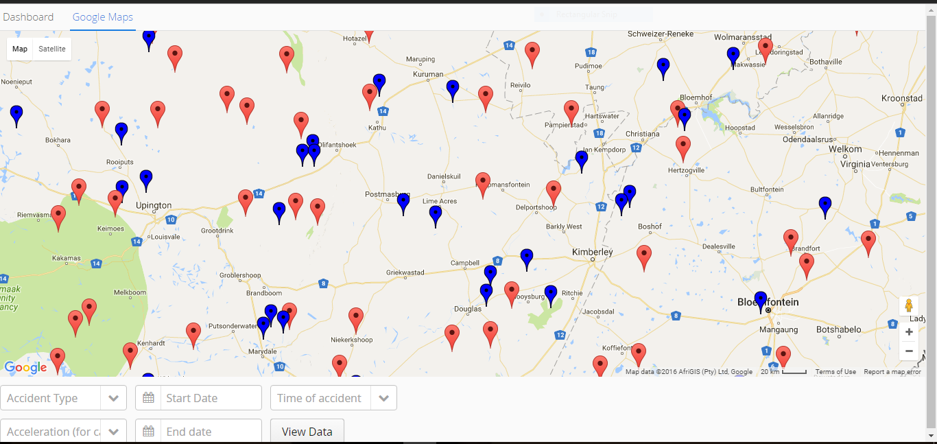
On the Google Maps page (Figure 1), users are presented with an overview i.e all the data points in the data set are
shown. Hovering over a single data point displays all the relevant information about the accident such as the date
and time of the accident. The drop down menus at the bottom of this page allow a user to select which data they
would like to see, filtering out the rest. This is based on the different dimensions of the data. Users can select to see one
type of accidents i.e. only car accidents or running accidents. Google Maps also has a zoom feature which enables users to
zoom in and out of particular regions. Two distinct symbols were used to represent the two types
of accidents on the map; car accidents are represented by red icons while the blue icons represent running accidents.
These symbols differed on only one feature, that is, colour because the marker icon is the common way of representing
locations on Google Maps.
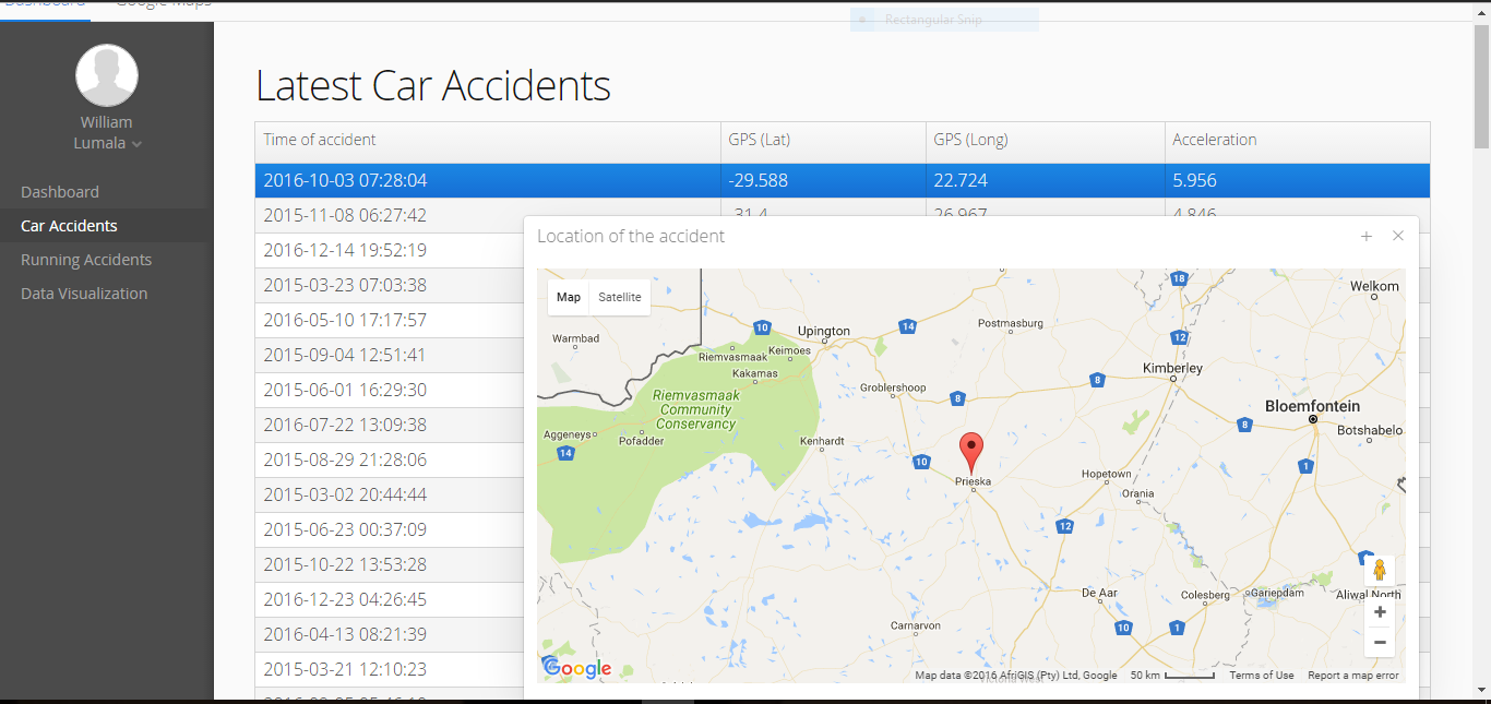
The table in Figure 2 shows all the data in the database. These tables can be sorted by any of the columns, enabling
a user to view the accidents in order of occurrence or acceleration at impact (only for car accidents). Right clicking
on a row in the table gives users options to view any details not shown in the table and the location of the accident on
Google Maps (as demonstrated in Figure 2).
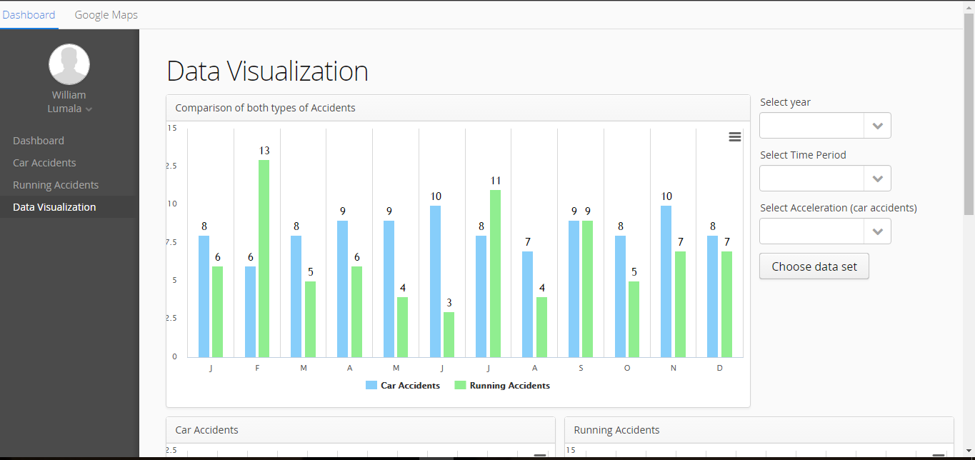
The application uses graphs; column charts and a line chart (not shown) to show any trends in the data. These are also interactive,
enabling users to filter out any uninteresting data and focus on a particular subset of the data.
Evaluation
Usability tests were conducted to evaluate the visualisation in the terms of effectiveness and usability. Effectiveness was measured using the metric of successful task completion while usability was measured using the System Usability Scale (SUS).
Experiment Design
Convenience sampling, a type of non-probability sampling, was used to select 6 of the 8 participants while the other 2 were selected randomly. Non-probability sampling was used to enable us to get participants that fit a specific criteria, that is, Computer Science Honours students who had done both the Data Visualisation and HCI modules. Most of the tests were conducted in a controlled environment of the Computer Science honours laboratory, where participants accessed a web-page that contained the visualisation using a laboratory computer. Participants were given a brief overview of the system, its purpose and the goal of the project before they completed four tasks and used the system to answer two visual queries.
Task Design and Visual Queries
The tasks and visual queries for the usability testing were designed with two main objectives in mind. Firstly, we wanted to establish whether users could effectively find a subset of the data i.e could users zoom into an interesting data and / or filter out unwanted data (essentially, testing the interactivity). Secondly, we wanted to determine how efficiently users could answer a visual query. The tasks and visual queries are explained in detail in the final paper .
Results
Results from the usability test are summarised below.
For a more detailed analysis of the results, please refer to the final paper .
Visual Queries and Successful Task Completion
Successful task completion is defined as the ability of a user to obtain information when carrying out a task.
Participants who obtained the right answer were deemed to have successfully answered a visual query, while those who
needed more than one trial to get the correct answer were deemed to have partially passed the visual query. The
same metric was used for the analysis in the four tasks. Tasks completed on the first trial without help from us were
categorised as successfully completed and the rest were categorised as failed. All the participants eventually completed
the visual queries and tasks.
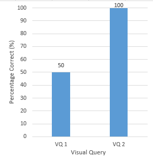
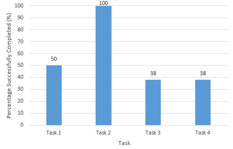
Figure 4 shows the percentage of the two visual queries successfully answered, that is, at the
first time of asking and with no help from the team members. Results showed that only half of
the participants answered the first visual query correctly while all the eight participants
answered the second one correctly. Visual Query 2 was a simple variation of Visual Query 1,
the results showed that the participants were more effective the second time and learned how
use the system quickly.
Figure 5 shows the percentage of the four tasks completed, i.e. which tasks were completed successfully. Based on the results, tasks 3 and 4 were significantly more difficult than the first two tasks. Task 3 involved using the table to get more information about an accident (Figure 2). Only three of the participants successfully completed this task. Task 4 involved simply hovering over a data-point on the map to show all the relevant information about it. This task had a similar completion rate to task 3 with only 3 participants completing successfully. We settled on the lack of visual cues as the reason for the low completion rates for tasks 3 and 4.
System Usability
The System Usability Scale (SUS) was used to gauge the users’ satisfaction and opinions of the systems. The SUS, a questionnaire, is a reliable tool for measuring usability of a system. It comprises 10 items and users’ responses are rated on a Likert Scale which ranges from 1 (“Strongly disagree”) to 5 (“Strongly agree”). Furthermore, the scale (SUS) provides valid results on small user sample sizes.
Each participant’s SUS score was calculated to give a mark out of 100 (the overall value of System Usability). The average of all the scores was then calculated: 78.75. In an analysis of 500 studies making use of the SUS, the average score was found to be 68. Thus, the visualisation falls just above the average. On a scale designed by Aaron Bangor, the score of 78.75 was found to be good and of an acceptable standard.