Visualisation
Introduction
The search results of digital libraries typically have monolithic text-based interfaces, lacking useful visual features. The NDLTD global search is a prime example. Distinguishing between publications of different genres is a very tedious process, which includes reading the title, abstract and tags of each search result. As such, I investigated the benefits of incorporating visualisations into the search results of the NDLTD.
Research Objectives
Background work has shown that a visual-based interface, alongside a visualisation, would prove highly effective. I hypothesized that the use of colour, imagery and skeuomorphism would greatly benefit users of the NDLTD global search. The plan was to group ETDs by genre, mimicking that of traditional libraries. Displaying ETDs as piles of library “books”, with each book having colour schemes and imagery based on their genre. This would allow for quick and easy identification of ETD subject matter.
To determine the effectiveness of the system developed, I introduce the following three research questions:
- Genres - Will the grouping of ETDs by “genre” be a useful system of organisation?
- Visualisation - Will the visualisation be more useful for finding relevant ETDs than a text-based interface?
- Skeuomorphism - Will the skeuomorphic visualisation of search results as a “pile of books” provide a better user experience?
System Design
To ensure the comparison between this system and the NDLTD global search was fair, I kept the latter’s core functionality intact. The visualisation system consists of a search bar, a filtering system, search results and an ETD information panel. All searches/queries made access the same SOLR index that the NDLTD global search uses.
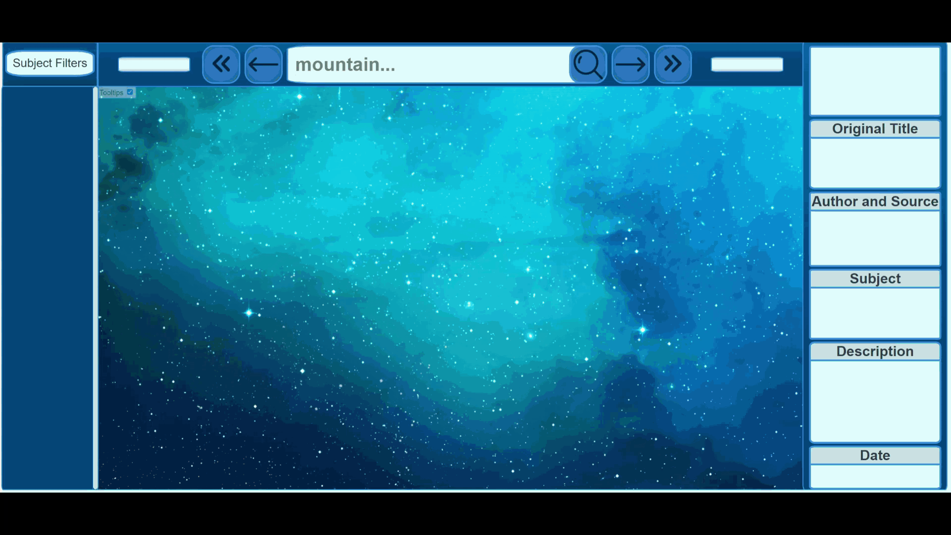
Search bar
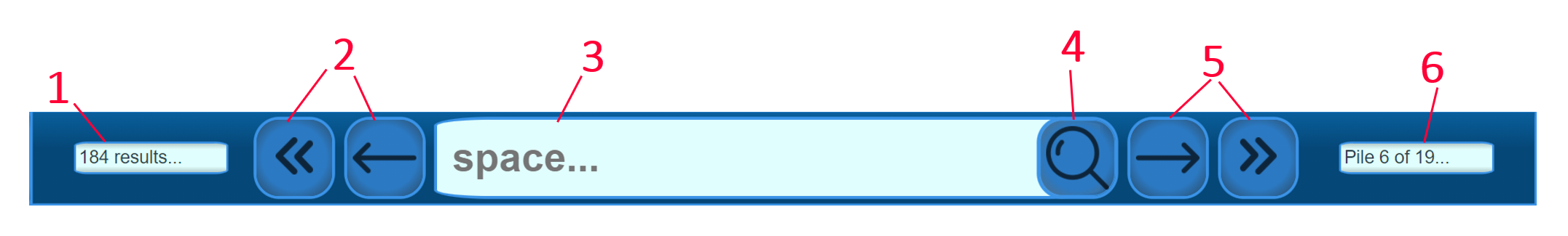
The search bar, labeled in red.
- A text box showing the number of search results.
- Backward-navigation buttons.
- Text input to allow users to type queries.
- A search button to submit/apply the query.
- Forward-navigation buttons.
- A text box showing the current pile being viewed and the total number of piles.
To make a search using the search bar, a user may click the text input (3) and type in a query. After clicking the submit button (4), they will be shown search results as piles of books. To navigate between the piles of books, they may click the navigation buttons to go back (2) or forward (5) between the several piles. Meanwhile, the number of search results (1) as well as the number of piles (6) are displayed.
When a user makes a search, javascript is used to retrieve JSON data from the SOLR index in which the metadata is stored. Once the JSON data is retrieved, it is formatted and stored locally as search results in a javascript list.
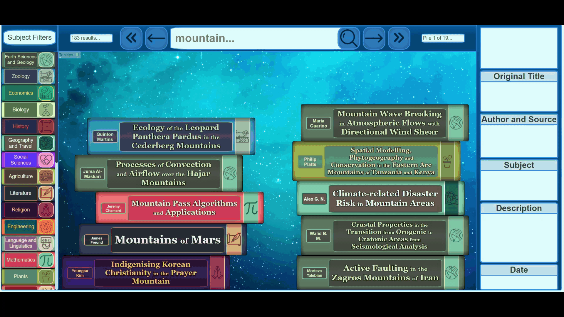
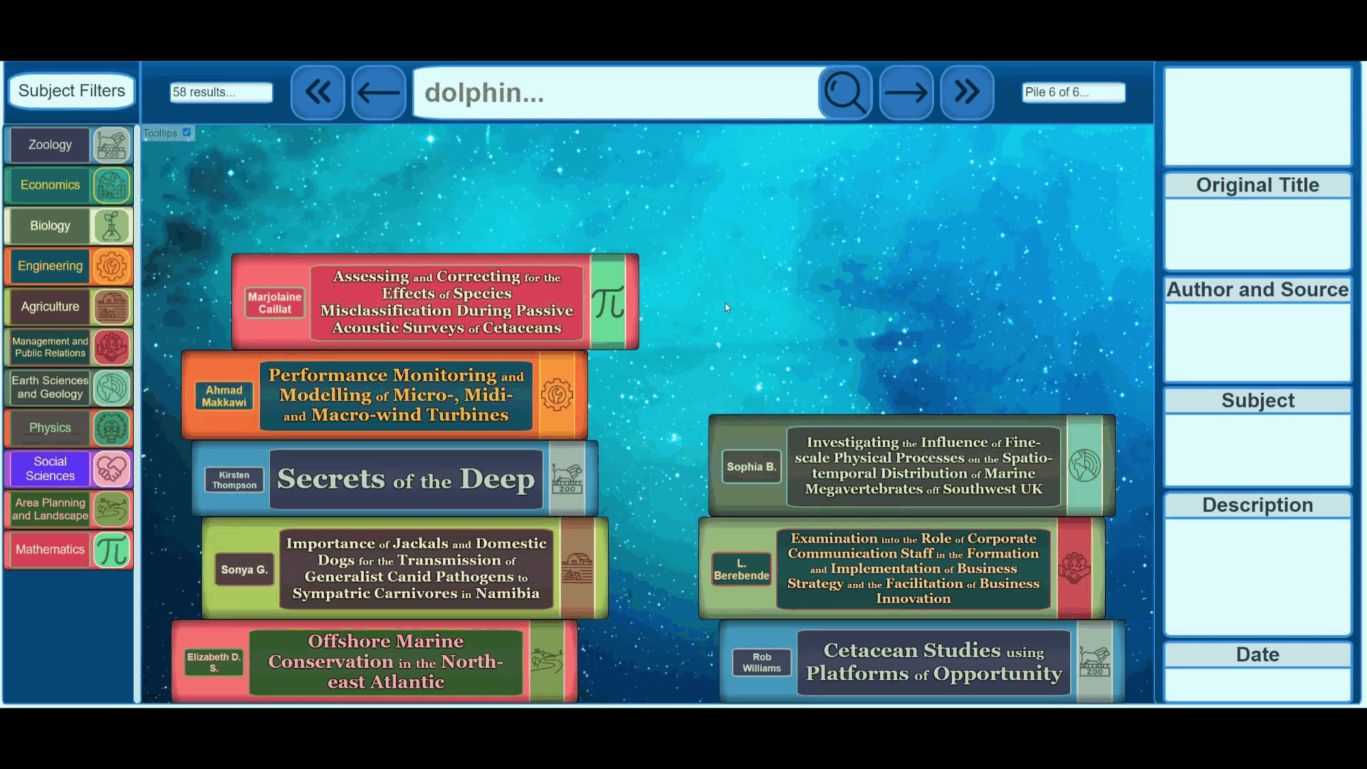
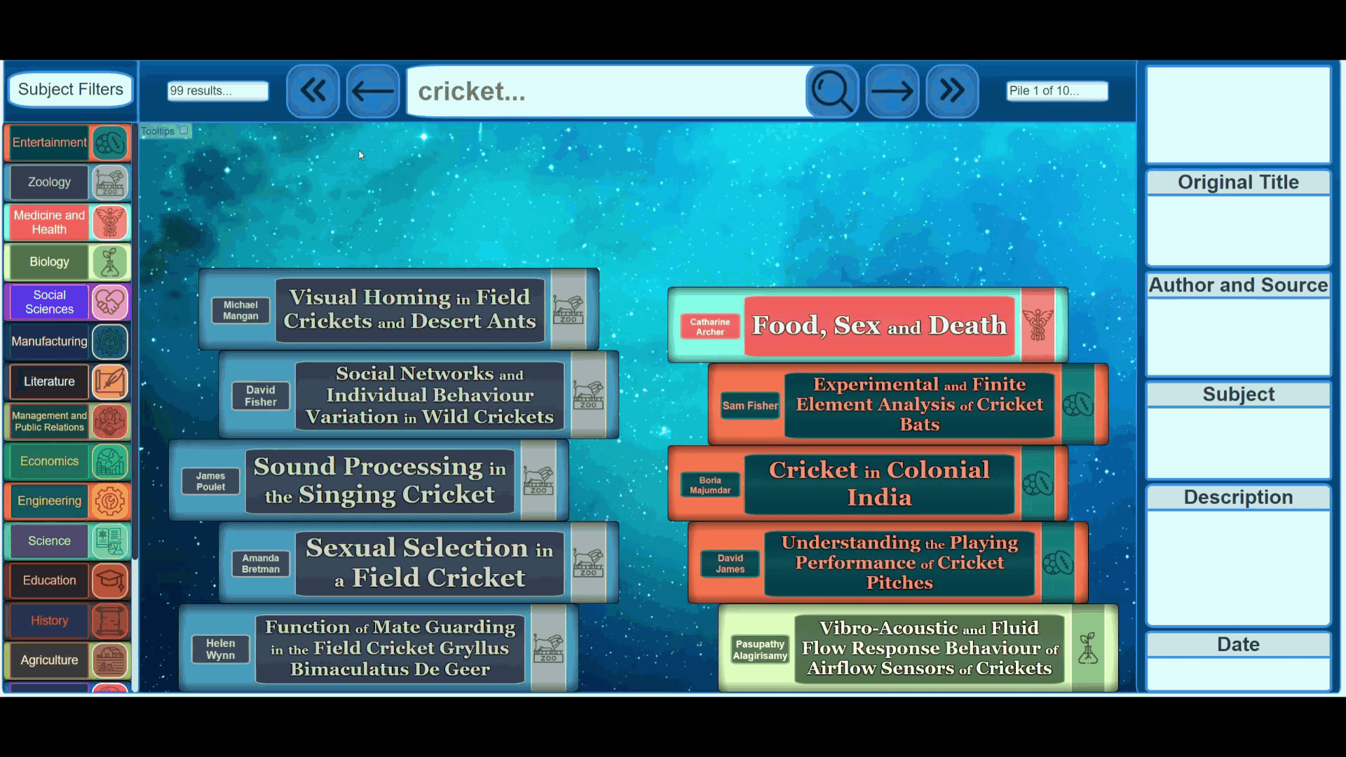
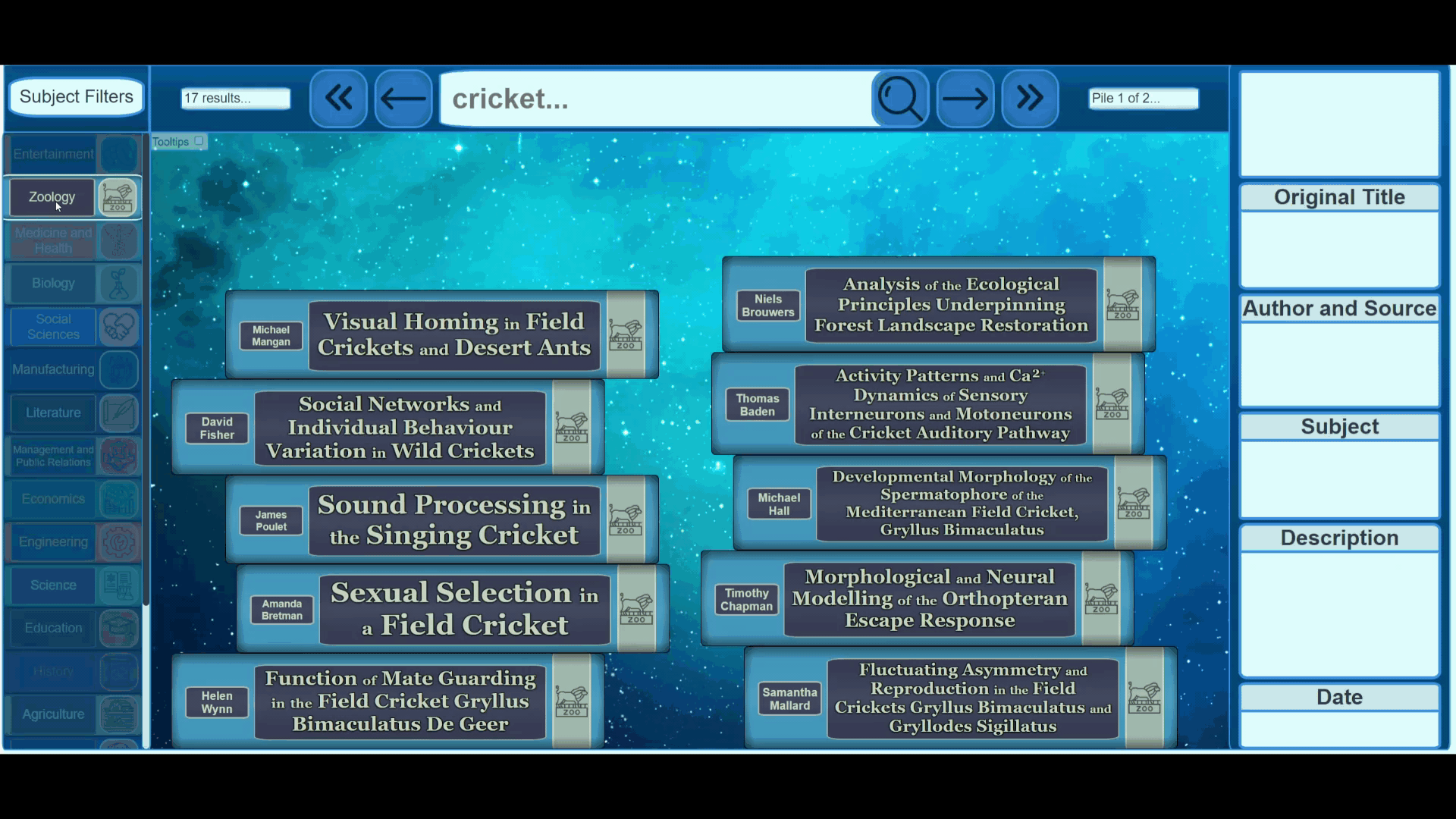
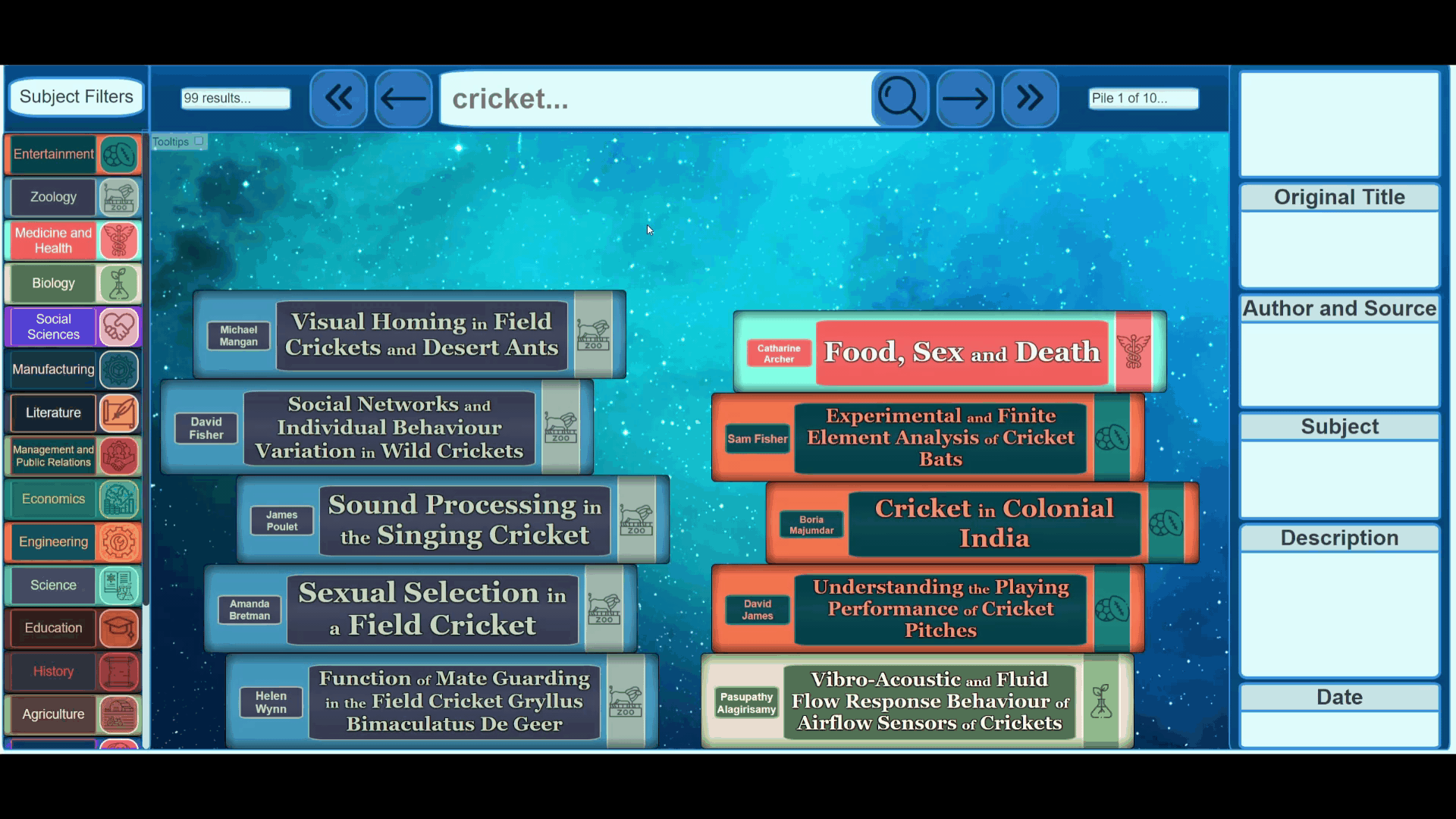
Search results
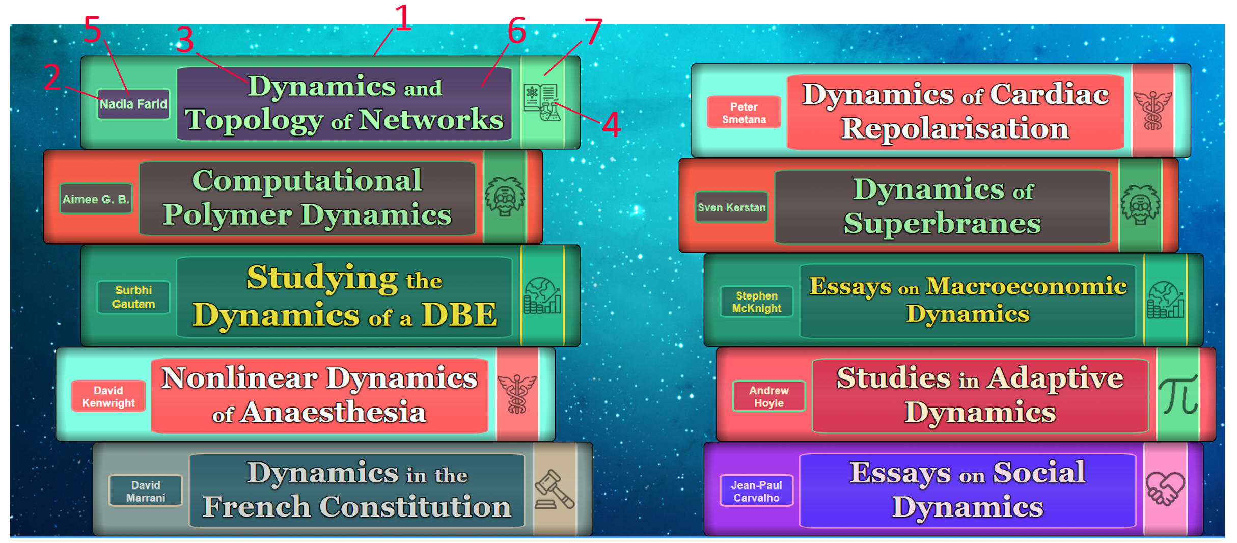
Search results for the query, "dynamic"
- A search result (ETD), visualised as the spine of a book.
- The author of the ETD.
- The title of the ETD.
- The icon of the ETD genre.
- The author background.
- The title background.
- The book "stripe".
Once a search has been made and metadata has been retrieved, the search results are displayed. In the above example, there are many different genres displayed, all containing unique icons and colour schemes. Genres displayed in the left pile are (from top to bottom) science, physics, economics, medicine and law.
The body of each book (1) is rectangular, slightly curved and shaded in order to mimic a real-life book-spine. Colour schemes for each genre are stored in dictionaries as strings of four hex-codes. For example, science's colour scheme is stored as: "#54436B#50CB93#71EFA3#ACFFAD". Each hex-code represents a colour that corresponds to a specific part of a book.
The first and last hex-codes in each string correspond to the backgrounds and font colours respectively. This way, colour schemes with high contrast between the first and last colour may be selected to ensure that book text is always visible and clear. The second hex-code represents the colour of the book itself. The third hex-code represents the colour of the stripe (7) as well as the outlines of the backgrounds.
All of this is done automatically via javascript and css, allowing for quick visualisation of search results, with over 50 unique looking genres.
Filters
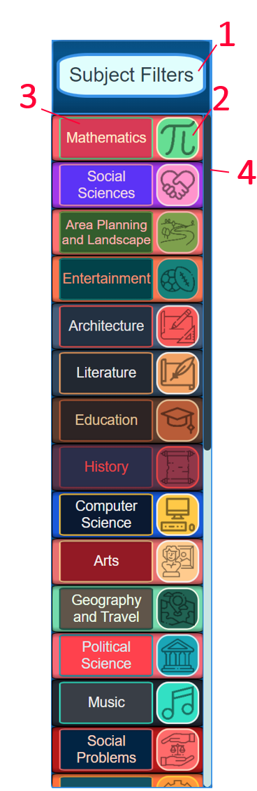
This panel contains filters that may be used to filter the search results.
- The title of the filter panel.
- The icon of a subject filter.
- The body of a subject filter.
- The scroll bar to navigate the filters.
Once a search has been made, filters are shown in the filter panel, sorted by relevance (frequency). These filters mimic the appearance of their associated book genres. To turn a specific filter on or off, the user may click the icon (2) of the filter. To turn all filters except a specific filter on or off, a user may simply click the body of a filter.
Genres that are filtered out of the search results will be "greyed out" (mnade transparent) in the filter panel. Hovering over a filter icon shows an "x" or a "tick" depending on if it will add or remove the genre from the search results.
All of this ensures a quick and easy, interactive filtering system.
Information panel
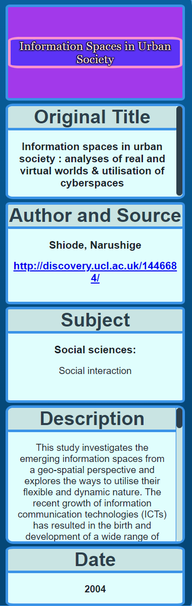
This panel shows all important information of a selected search result.
From top to bottom, it contains:
- The title as it appears on the book.
- The original (unshortened) title of the ETD.
- The author of the ETD as well as a link to where it may be accessed.
- The subject of the ETD.
- The abstract/description of the ETD.
- The date the ETD was published.
Upon clicking a search result, that search result is "selected" and its important information is diplayed in this panel.
Gifs
See below some gifs showcasing the visualisation system.
Book falling animations after making searches.
Navigation between book piles.
Clicking/selecting a book.
Filtering out book genres.
Filtering in book genres.
Filtering everything out except a specific genre.
Evaluation
Both quantitative and qualitative data was gathered to answer the research questions.
Quantitative data was gathered by making use of the Usefulness, Satisfaction and Ease of Use (USE) Questionnaire. The USE questionnaire contains 30 questions falling into four different categories: Usefulness, Satisfaction, Ease of Use and Ease of Learning. To achieve numeric results, participants were asked to provide ratings from 0 to 10 for each of the USE questions.
To gather qualitative results, we asked participants what they liked most and least about the system, as well as what they would change about the system, and if they had any general comments about the system.
We were able to gather 30 participants, of which 28 provided legitimate responses. Participants were students from UCT who had at least 3 years of study.
Before users answered the questionnaire, they were to complete a list of instructions using both the NDLTD and the visualisation system so that they may answer with the comparison in mind.
Results
Participant composition
See the below pie charts for participant composition
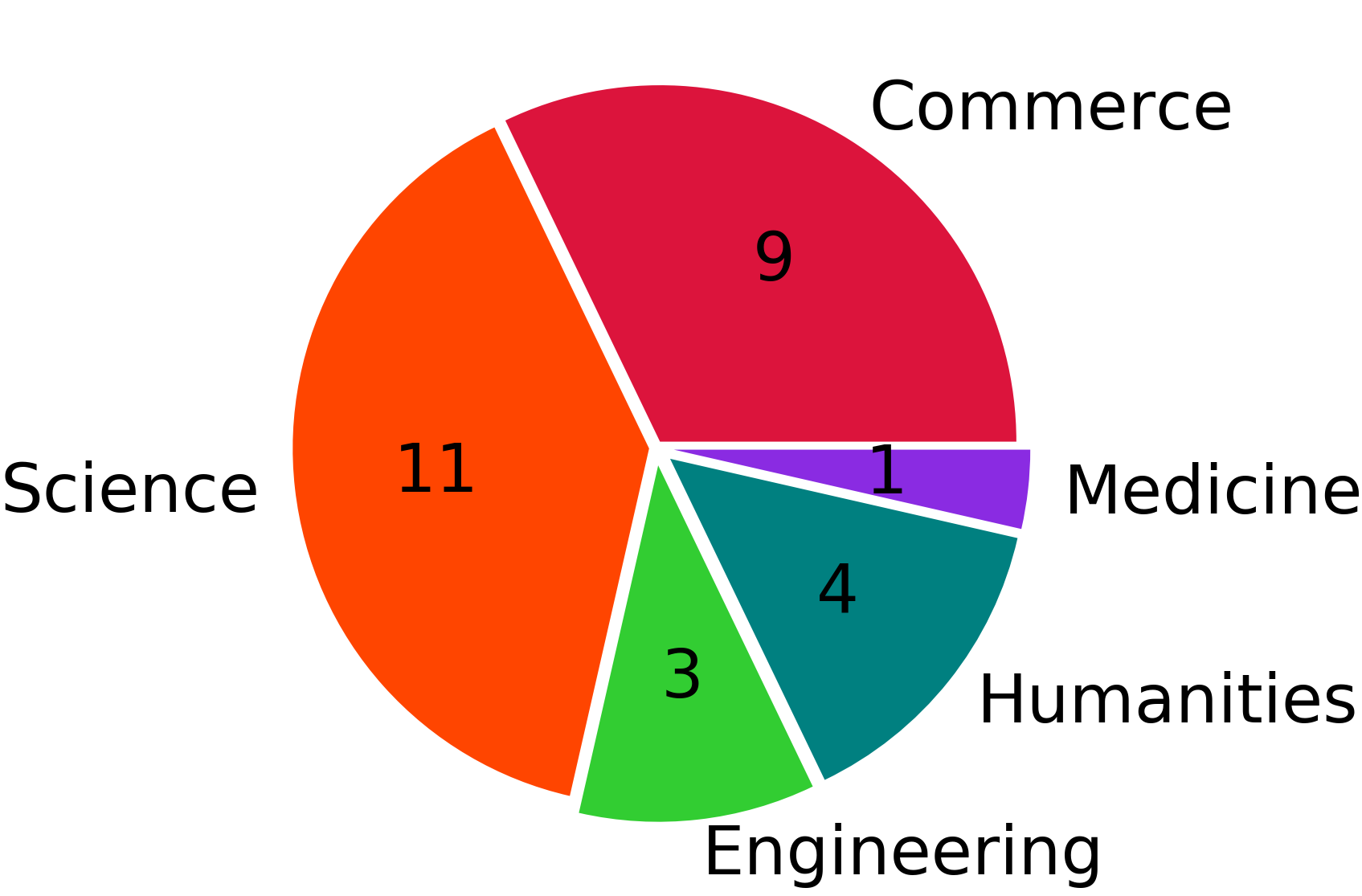
Faculty composition
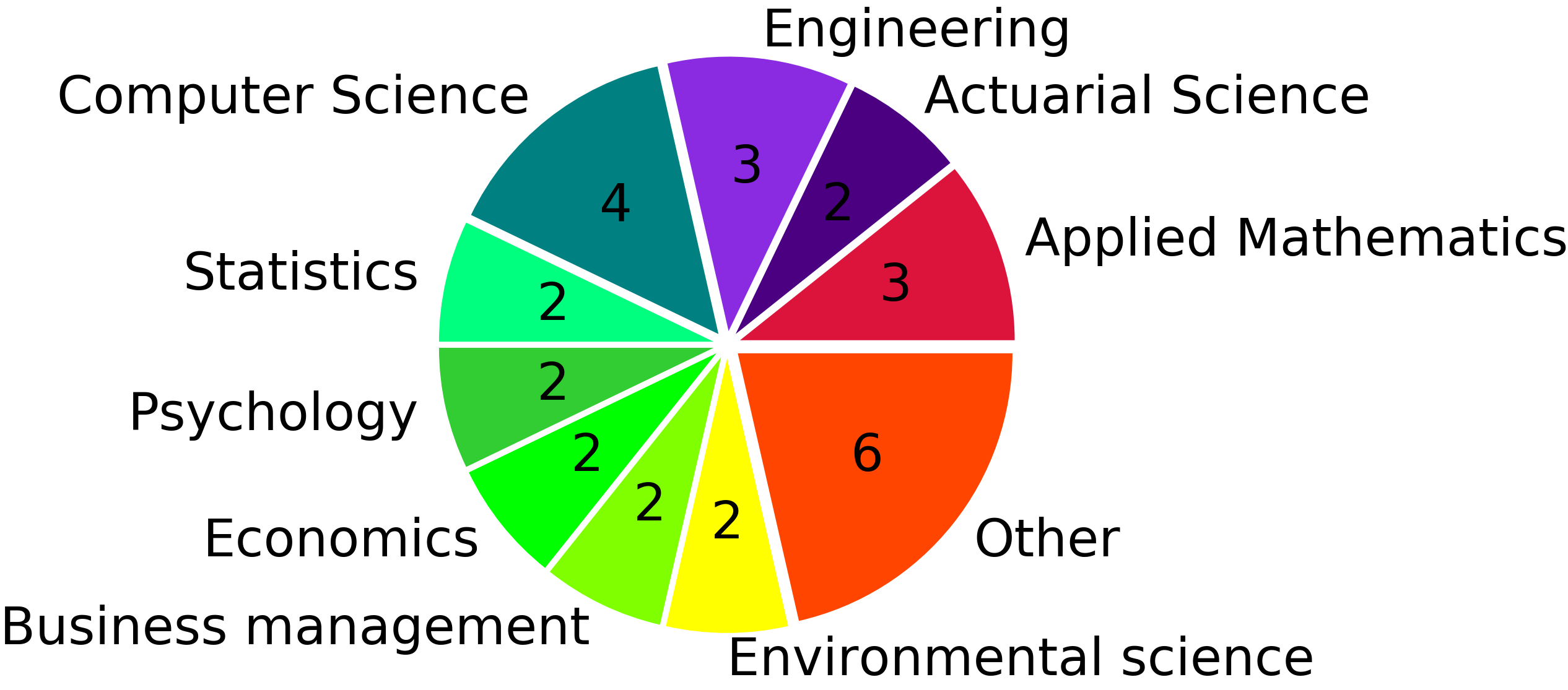
Discipline composition
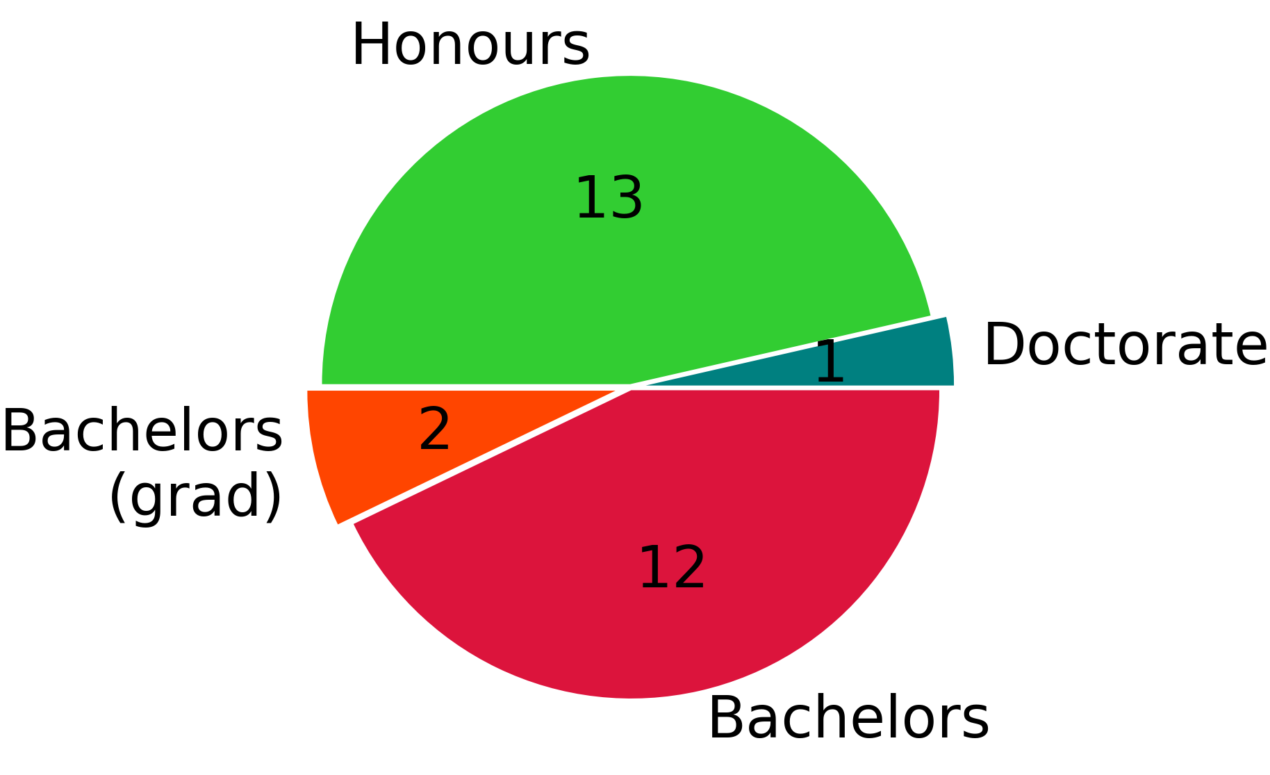
Degree of study composition
Numeric results
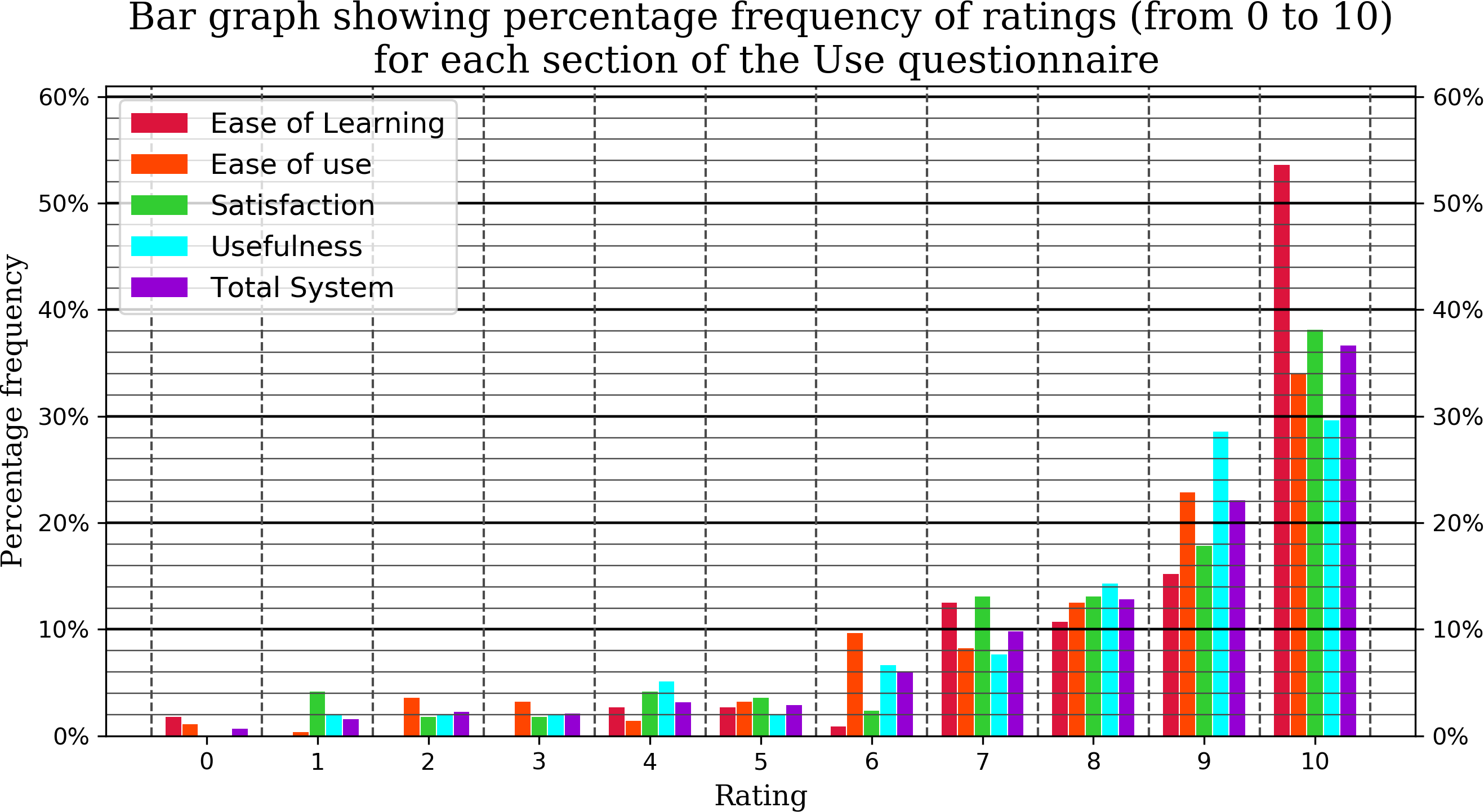
The above graph contains the cumulative user ratings for each section of the use questionnaire. Each bar is measured as the percentage frequency of occurrence for that rating in that specific section. The Total System is the percentage frequency for all ratings, regardless of category. We see that the majority of ratings from all categories is very high.
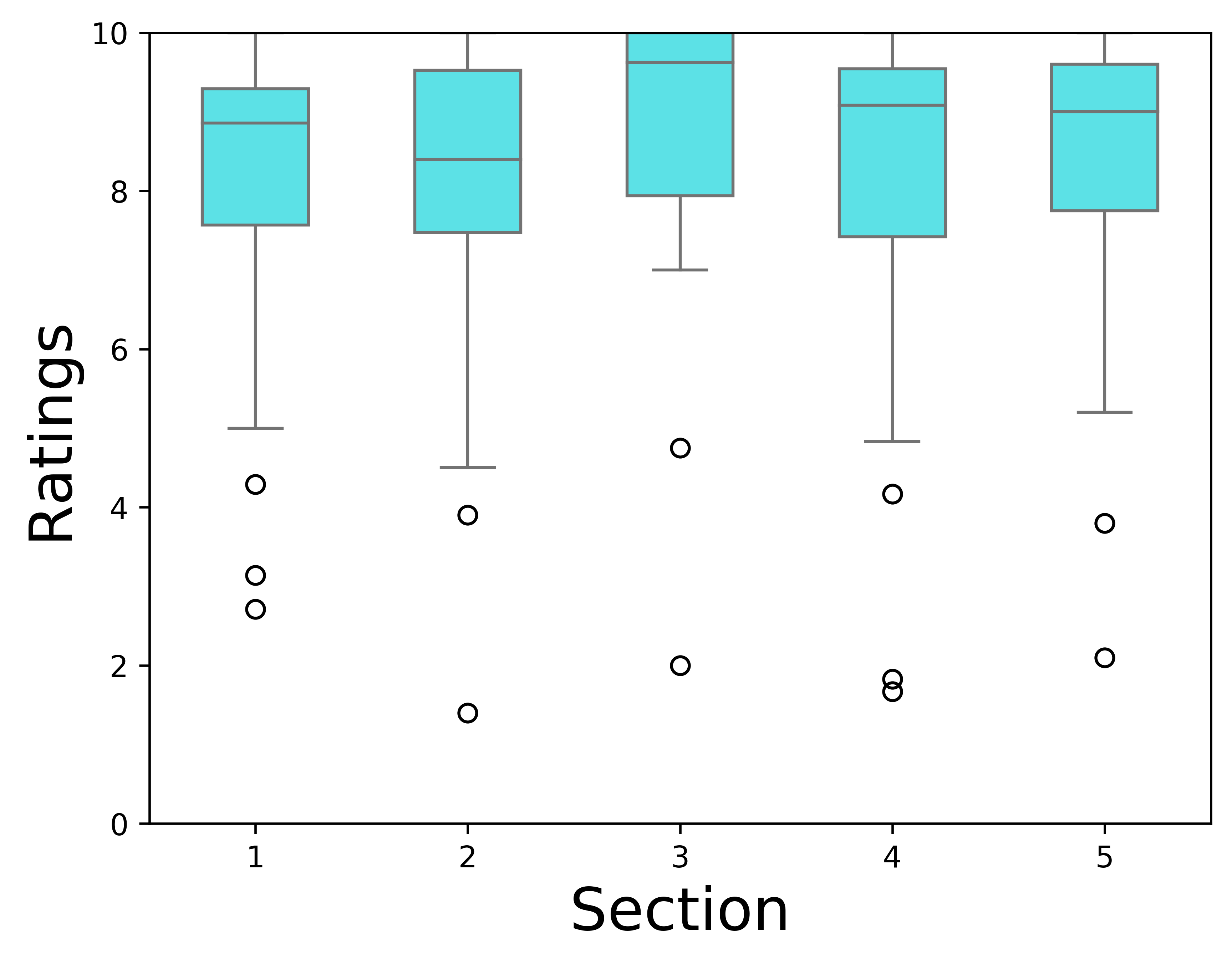
The above box chart shows the average sectional ratings for every user. Each section being Usefulness, Ease of Use and Ease of Learning aned Satisfaction (in order). The 5th section is simply the average of the 4 sectional ratings for each user. There were a few outlier uses who rated the system much lower than the majority. Their ratings can be seen as small circles on the chart. Overall, the vast majority of users found the system to be: useful, easy to use and learn, and satisfying.
Qualitative results
See below a list of quotes provided that support each of the three research questions.
Quotes to support research question 1
Quotes to support research question 2
Quotes to support research question 3
Conclusions
From the numeric and qualitative results, we conclude that each of the three research questions have been answered with a resounding yes. The book genres were useful and the visualisation was useful. The system provided a great user experience too.
This section was completed by Dean Williams.
Downloads
The links for the user-organised section resources are below. For overall project resources, please visit the overview page.