About
Description
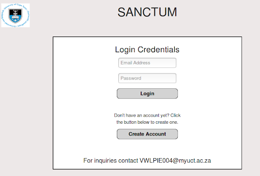
The user-interface is a Web-based interface, and is split into two sections: the front-end Web pages, and the NodeJS server. The Web pages let users view their ongoing and completed jobs, their available data sets, and also the results and visualizations of completed jobs. Users can also upload new data sets, and create new jobs on their uploaded data sets. The NodeJS server is responsible for serving the Web pages, handling separate user logins and sessions, starting up AWS clusters, sending the data sets and job requests to the clusters, and retrieving the results once the jobs have completed.
Design
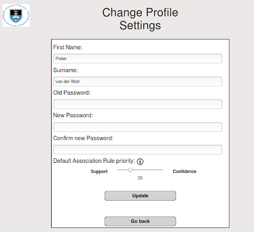
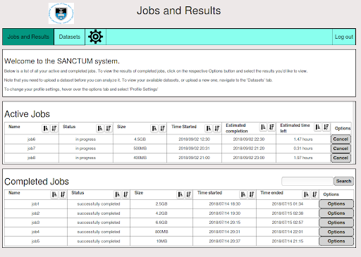
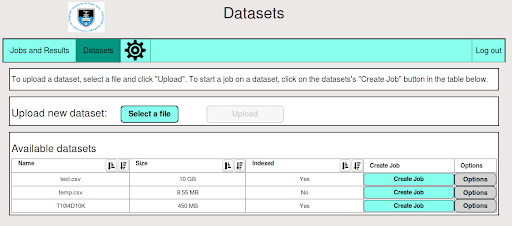
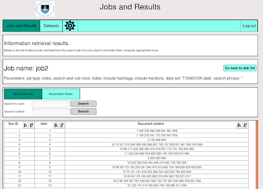
The interface followed a data-centric approach, in which the presentation of the available data is a priority, and all the functionality and actions are linked to the data. When a user logs in, they are presented with a list of their active and completed jobs. The “Options” button next to the completed jobs lets users access the results of the completed job, and also delete or rename the jobs. A navigation bar at the top lets them access the Datasets page, as well as their Settings page, and a Logout button. The Datasets page presents their list of available data sets in a table format, and a “Create new Job” button lets users create a job on the selected data set.

Results
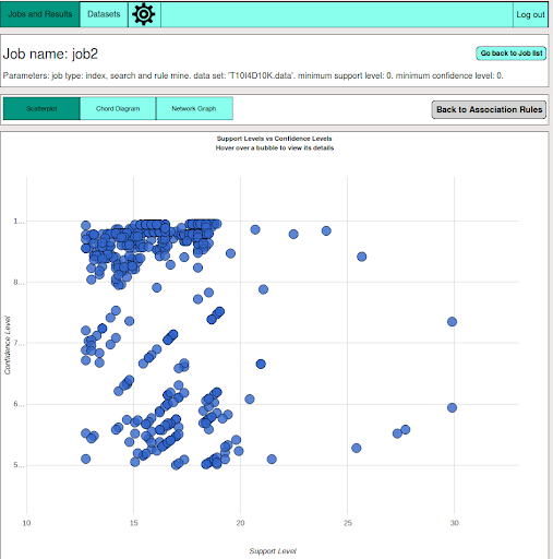
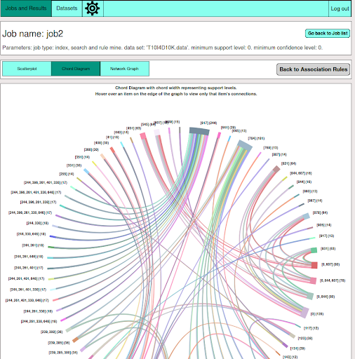
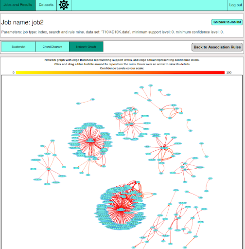
The interface was tested with 10 Computer Science students, with a combination of Honours, Masters, and PhD students. During the testing users were asked to perform a range of tasks that cover all the interface’s functionality. Users were also asked to interpret the visualizations of the results. The interface was scored based on Nielsen’s 10 Heuristics, and received an average score of 3.9 out of 5 points. Users also successfully interpreted the visualizations and felt that the visualizations made the analysis of the results easier.