Visualisation Tool - Thethela Faltein
Aim of the Project
Information or data visualization is a critical part of research and communication of results due to its ability to synthesize large amounts of data into effective graphics, and visualization aids in the understanding data from experiments. This is way visualization is utilized in the VRFear experiment and other emotion inducing experiments that measure physiological signals, done by the University of Cape Town’s psychology department.The researchers (involved in emotion inducing experiments) have access to two visualization tools: AcqKnowledge and Excel. But these visualization tools have drawbacks. AcqKnowledge is expensive, significantly restrictive and can only work on one data set at a time. Excel is a general use tool and not made specifically for handling physiological data. The main aim of this project is developing an alternative visualization tool for the researchers, the tool will not have drawbacks of other visualization tools. The visualization tool be will be a desktop application. A user-centred design was used to develop the application. Design ideas were taken from the information/data visualization literature and user requirements.
Features of the visualisation tool
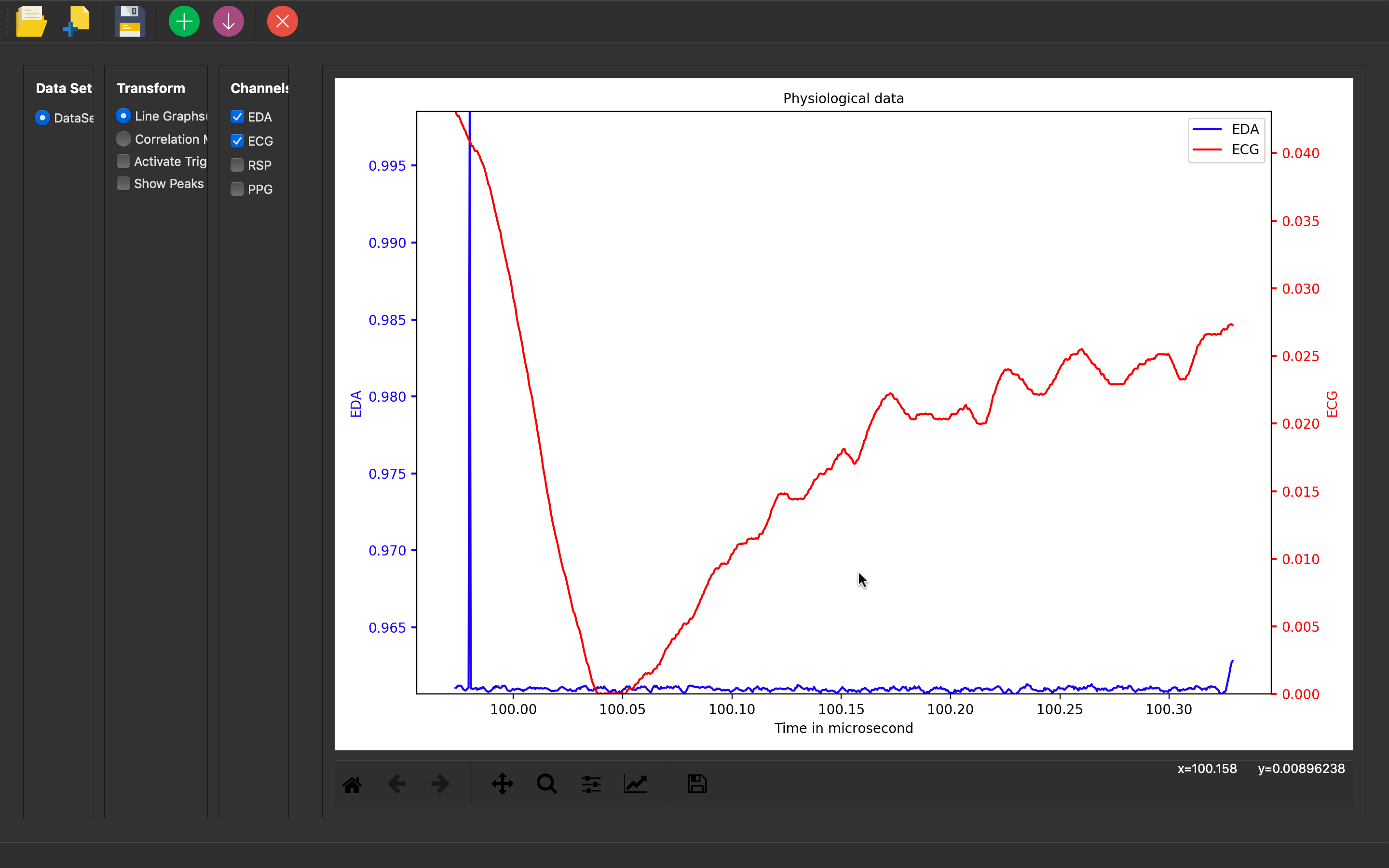
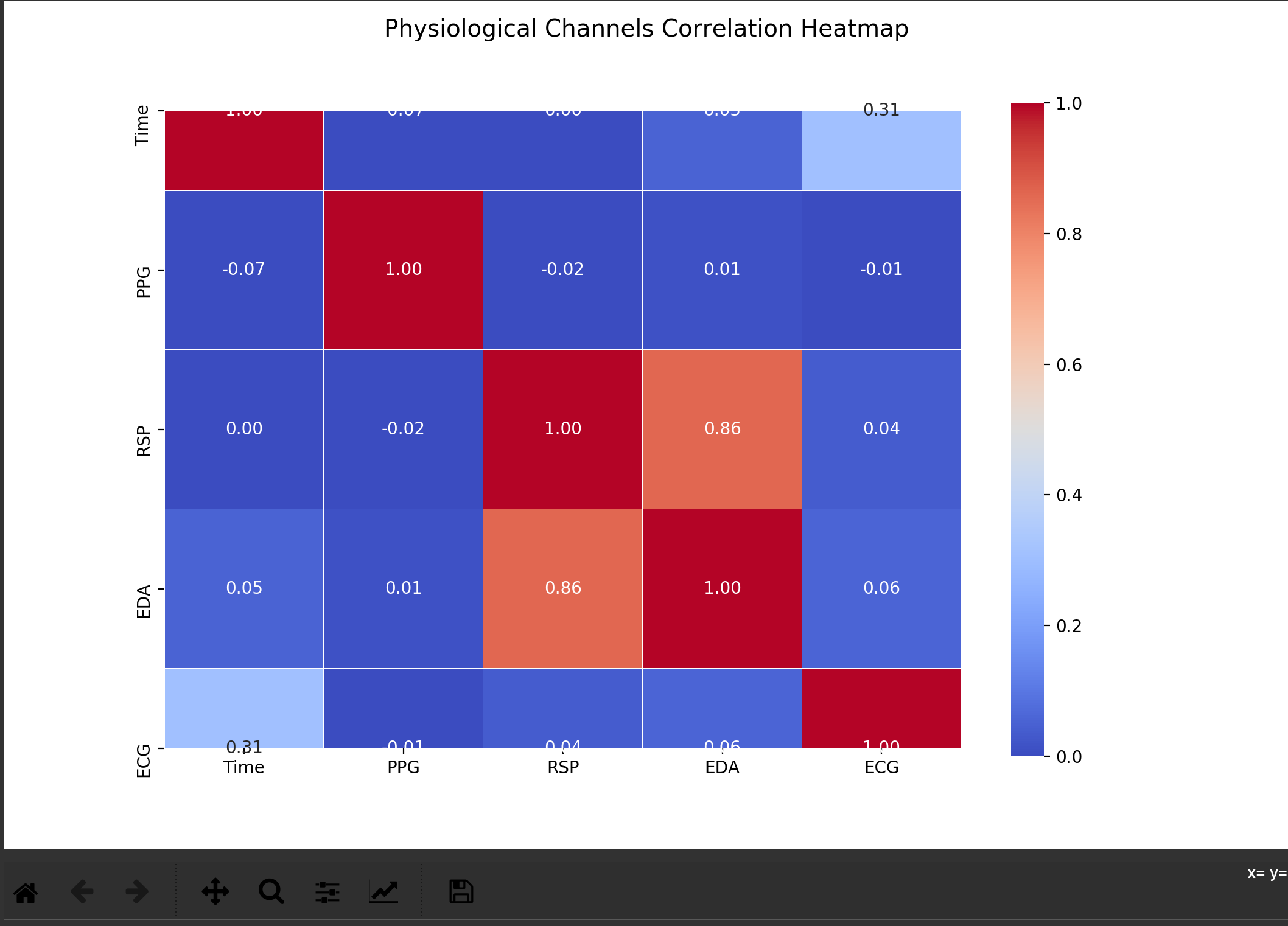
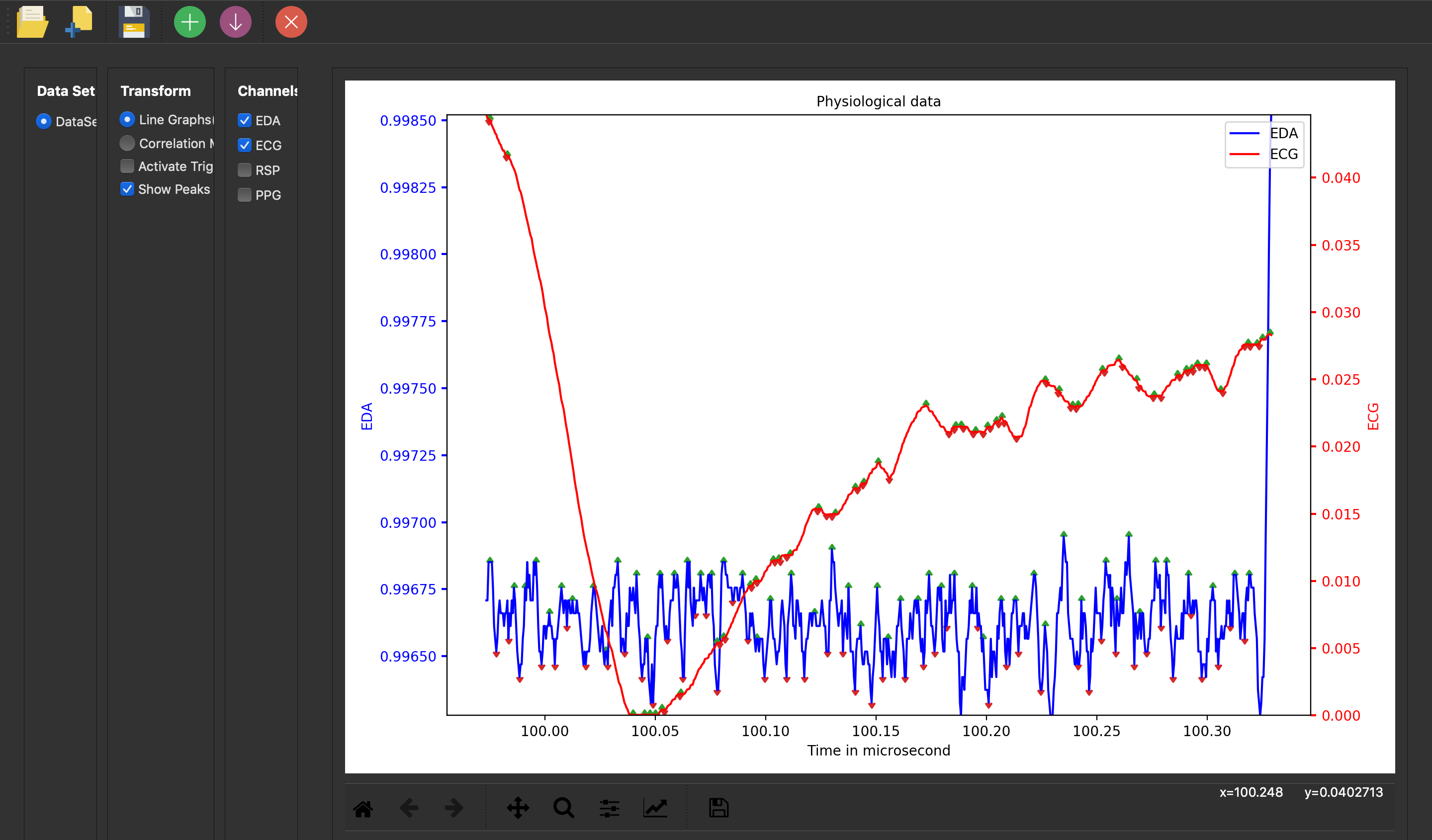
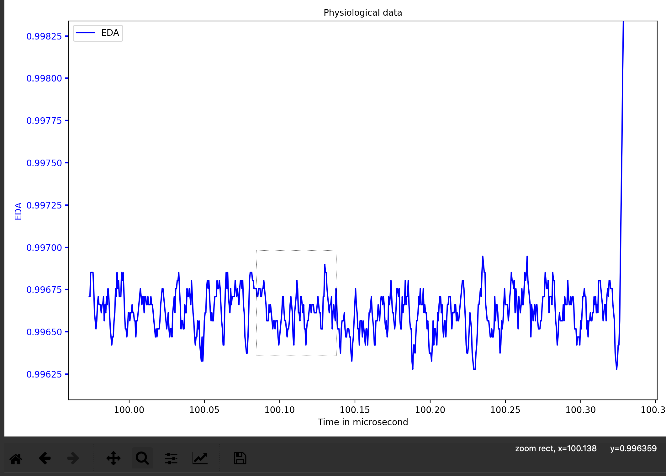
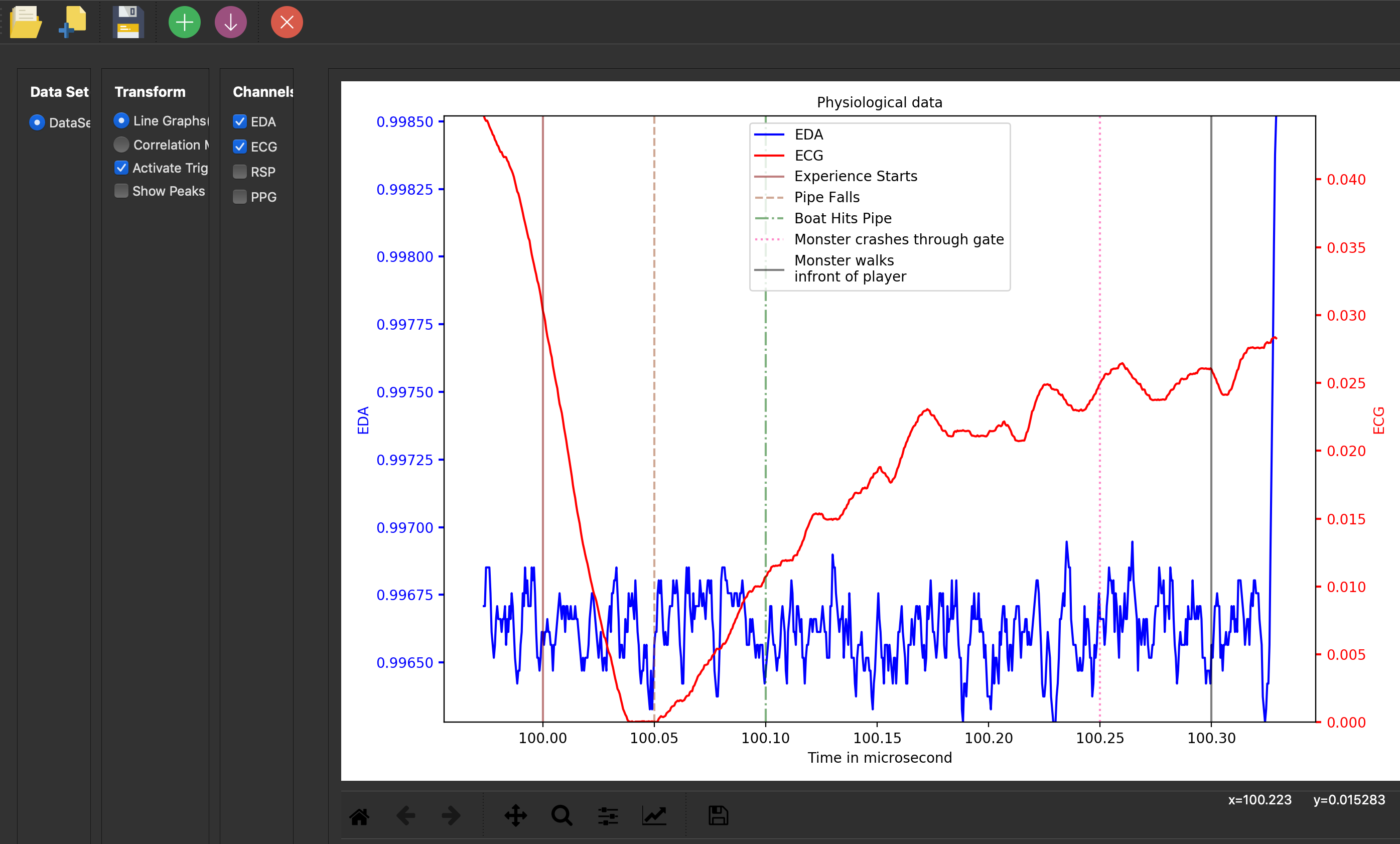
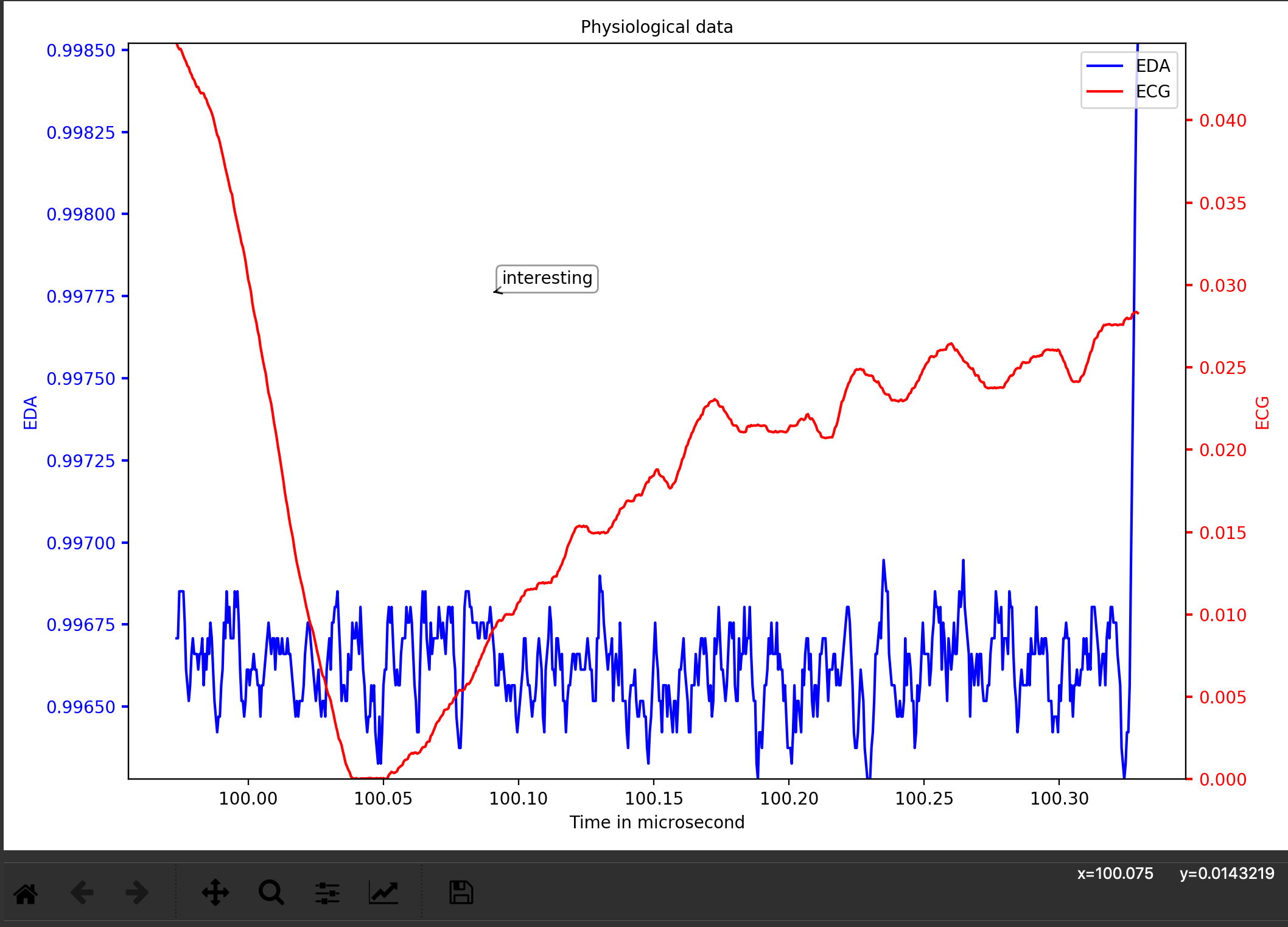
The data to be visualised is obtained from the VRFear experiment. A participant's data contains four physiological signals. A participant's data is called dataset in the application and the physiological signals are called channels. The physiological signal(s) can be visualised as line graph(s). To visualise the correlation between the different physiological signals, a correlation heatmap is used. The application provides the visual aids that highlight peaks and troughs on the different line graphs.The application can also highlight special events/triggers that happened in a virtual environment or movie etc. The user can zoom-in on particular area and a user can add annotations on the plot area. The user can also download the graphs and save the state of the application.
Evaluation Study
To evaluate the application, a heuristic evaluation was done. For our heuristic evaluation, evaluators were asked to find at least six problems with the application using Nielsen’s ten usability heuristics for user interface design as they were using the application. Evaluators had to describe the problem, say which heuristic was violated, give recommends for fixing the problem and assign a severity level to the problem. The severity levels: low, medium, high and critical. Then after they had identified the problems, they had to rate the usability of the application using a 5-level Likert-like scale (1- very poor to 5 - very good, 3- reasonably usable). The evaluators were the clients.The clients are: James Gain (computer science professor and project supervisor), Timothy Gwynn (computer science master student) and Siphumelele Sigwebela (psychology master student).
Nielsen’s heuristics- Ten Usability Heuristics for User Interface Design:
- Visibility of system status.
- Match between system and the real world.
- User control and freedom.
- Consistency and standards.
- Error prevention.
- Recognition rather than recall.
- Flexibility and efficiency of use.
- Aesthetic and minimalist design.
- Help users recognize, diagnose, and recover from errors.
- Help and documentation.
Results
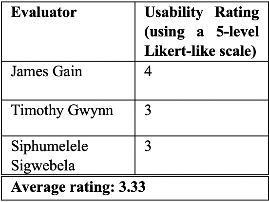
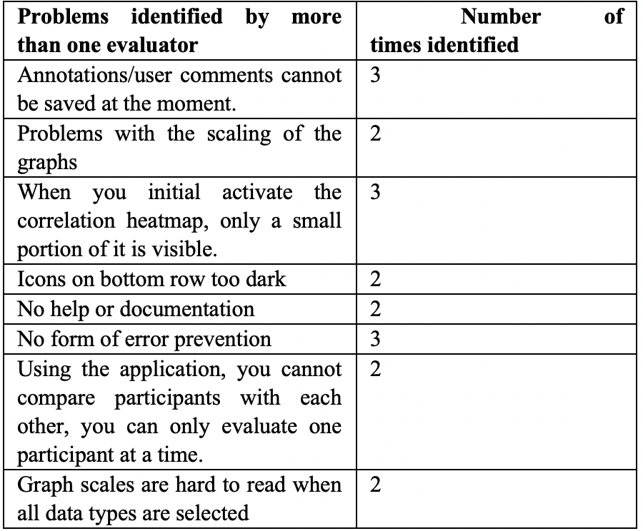
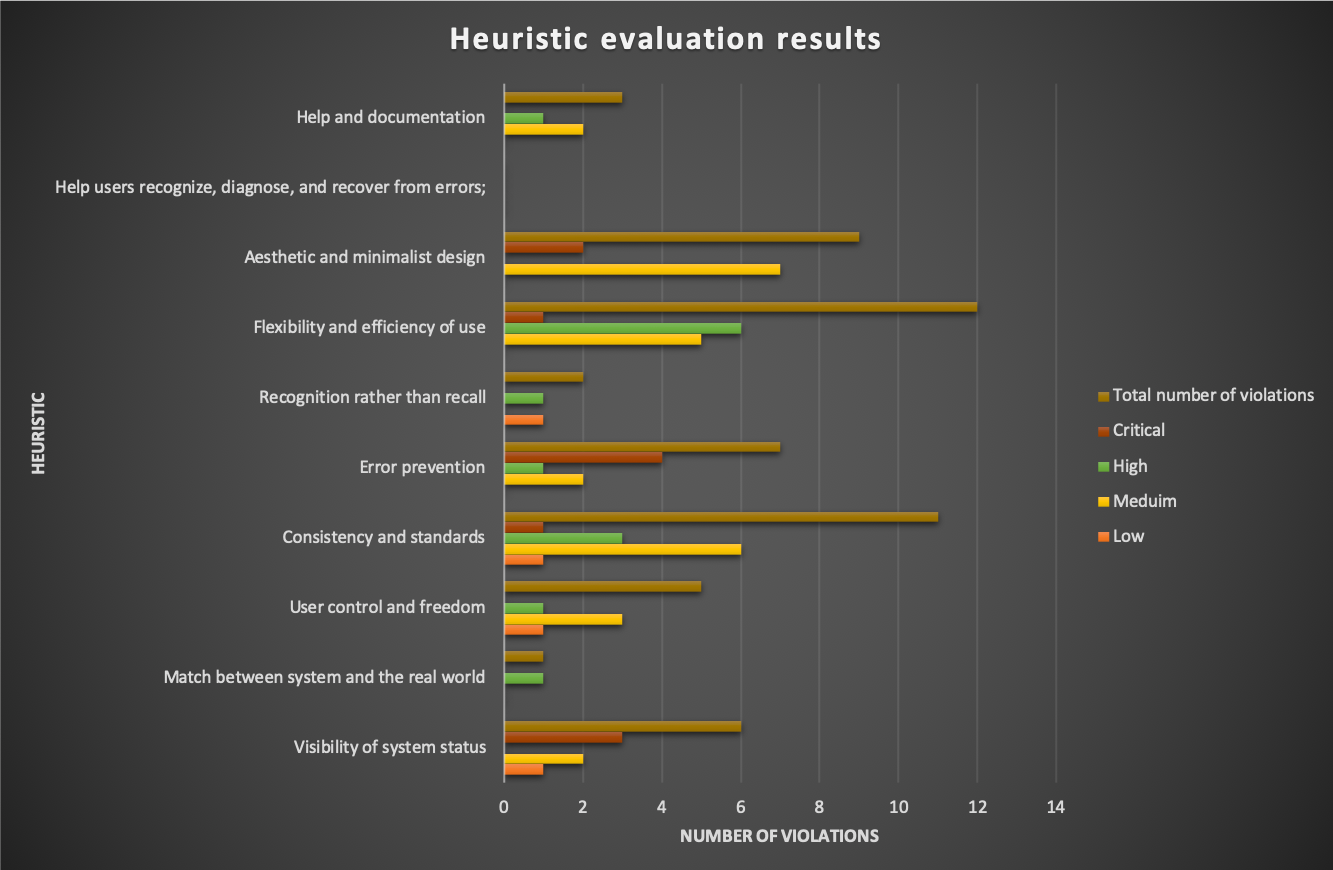
The application has an average usability rating of 3.33 and the heuristic with the most critical problems was error prevention and the heuristic with the most problems was flexibility and efficiency of use.